8 Car company logos and their meanings!
Modified On Oct 20, 2015 03:05 PM By Abhijeet
- 2K Views
- 1 Comments
- Write a comment
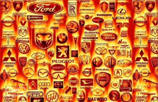
A brands logo reflects its identity and extends trust in the product it is nailed on. It carries the brand’s legacy in a simple and sober design creating an icon, and not a mere ornament. You instantly recall a car company (well mostly that is) just by looking at the logo it bears.
Also Read: Drive to Discover 5 with Honda Mobilio: Solace in Nilgiri Hills
Some car logos exude an image of reliability, some have prestige, and some bear the company’s history with them. Here are a few which mean something vast and exciting than just being pretty to look at.
BMW
BMW started its life making airplanes. As far as the popular myth goes, the BMW logo bears a spinning white propeller against the backdrop blue colour of the sky.

But actually BMW took strong interest in the brand RAPP, an aircraft engine manufacturer, and started assuming all its business segments. BMW wanted their logo to be oriented towards the RAPP logo. RAPP had a black horse in its symbol, but BMW wanted the Bavarian national colours in the symbol, however the letters were arranged exactly as they were in RAPP’s logo.

Kai Jacobsen, Automobile Historian, BMW Group states, “For the customer the logo means that he/she is buying something special, and for the brand itself the logo means they must meet the customer’s expectation of high standards again and again”.
Audi
The four rings in the Audi logo represent the collaboration of four predecessor companies, Auto Union.

Also Read: 10 iconic cars that changed the automobiling
While the name Audi comes from the Latin translation of the surname of the founder, August Horch, which meant ‘listen’ in German and meant ‘audi’ in Latin, the four rings represent Audi, Horch, Dampf-Kraft-Wagen (DKW) and Wanderer.

Mercedes-Benz
Back in 1926, Emil Jellinek, Gottlieb Daimler and Carl Benz laid the foundations of one of the most popular brands in the automobile industry.

The brand logo of this German giant is as simple as it is meaningful. The three-pointed tips of the star represent transportation on land, water and air.
Toyota
Toyota’s intertwined ovals are supposed to lend out warm and happy feelings. The symbol itself implies the overlapping of the hearts of the consumer and the soul of Toyota products. The empty space beyond the oval represents the limitless possibilities for technological advancements that may come about in the future.

The development of this logo actually took about 5 years as it was essential to create a suitable one as the company spread to other countries and continents.
Ford
Ford’s logo has always been very simple and sober. The actual ‘Centennial Blue Oval’ that we come across everyday came into existence in 1976.

The oval exudes a spirit of reliable affordable vehicles which as economic to run. The original Ford logo was designed by C. Harold Will back in 1909. Apparently the colours don’t mean anything specific so much so that they were chosen to be a pretty sight on the vehicle.
Volvo
The Volvo logo traces it’s meaning back to ancient times. The sign actually is a pre-historic symbol of Iron. This symbol was also used to represent the planet Mars, the God of War, by the Roman Empire, and is also a symbol for ‘Man’.

But sticking to Iron, Swedish iron was considered to be much superior than produced by other countries. Thus, the company wanted to highlight its vehicles to be made of Swedish iron, reflecting it in their logo.
Porsche
One of the most iconic brand and logo on the planet, Porsche, plainly represents Germany. The logo depicts the arms of the city of Stuttgart. Stuttgart comes from the German word ‘Stuotengarten, where ‘stuoten’ means breeding horses and ‘garten’ means garden.

Hence the horse became a basic part of the logo, and the antlers and red-black strips are components of the arms of the Kingdom of Wurttemberg forming the rest of the Porsche crest.
Rolls Royce
The Rolls Royce logo was created to captivate its audience. So powerful is its presence that anyone who sees it once will never forget it! The logo contains two ‘R’s from the company initials that are separated by a hyphen signifying the partnership between its two co-founders.

‘The Spirit of Ecstasy’ or ‘The Flying Lady’ is a beautiful statue that adorns the brilliant cars made by the brand, but is very rarely used in corporate or brand advertising.

Also Read:
0 out of 0 found this helpful


